14

Pretty straightforward question:

What should Workplace.SE make their logo and site design? Any ideas?

9
  • 1
    Fairly simple and professional IMO, more like User Experience than Role-playing Games but I don't have specific ideas right now
    – Zelda
    Commented Apr 16, 2012 at 11:51
  • 9
    Anyone else thinking Dilbert meets XKCD? Commented Apr 16, 2012 at 16:49
  • @Chad I also thought Dilbert but couldn't think of how to incorporate it stylisticly
    – Zelda
    Commented Apr 16, 2012 at 16:53
  • I have been chucking over the though of stiky-hair boss :p Commented Apr 16, 2012 at 16:55
  • 1
    While the bulk of our questions, at least in the beginning, will be focused on the IT world and Cubicle-land, we shouldn't design the site to obviously exclude other, non-office, non-IT workplaces.
    – Jacob G
    Commented Apr 16, 2012 at 20:36
  • 1
    @JacobG in the West "work", especially "professional" work simply evokes the office-based work environment of carpeted walls, sticky notes and binders. In addition, less-office oriented work related items tend to veer far too job-specific. Oil cans, plungers and medical lasers all mean work to some people, but not 99% of people.
    – Zelda
    Commented Apr 16, 2012 at 21:14
  • @Chad I was thinking of plagiarizing Office Space. :) "Work Sucks." :)
    – Karlson
    Commented Apr 26, 2012 at 18:40
  • @Karlson I think gold badges should be red staplers :) Commented Apr 26, 2012 at 19:48
  • @Chad I'll second that. :) That would be really cool. Black Staplers, White Staplers , and Red Staplers for the Badges!
    – Karlson
    Commented Apr 26, 2012 at 19:52

10 Answers 10

10

Our tabs could be like those Manilla folder tabs:

enter image description here

9

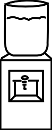
Somehow, somewhere, there should be a water cooler in it.

5
  • I think a watercooler icon would be perfect. Commented Apr 17, 2012 at 13:27
  • 7
    The Watercooler really should be our Chatroom name
    – Zelda
    Commented Apr 17, 2012 at 15:01
  • Problem is it's a busy item for a background image. Possibly as a part of an icon or logo though.
    – Zelda
    Commented Apr 27, 2012 at 21:31
  • 1
    And lo and behold, 'tis done!
    – TRiG
    Commented Feb 6, 2014 at 10:20
  • and it came out that this was true like that
    – DarkCygnus Mod
    Commented Aug 16, 2017 at 23:07
5

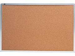
Work always makes me think of those cork bulletin boards. Perhaps we can incorporate that somewhere?
enter image description here

1
  • 3
    This should totally be the background of our community bulletin...if it can be made readable
    – Zelda Mod
    Commented May 13, 2012 at 20:18
3

To be unoriginal, our badges could be coffee mugs:

enter image description here

1
  • 11
    I'll upvote this if someone delivers me coffee every time I earn a badge.
    – voretaq7
    Commented Apr 16, 2012 at 18:22
3

Our badges could be more like Neck-Tie icons, since tie represents a formal work environment. Much like the following icon in Gold, silver and bronze color.

1
  • 2
    Not sure ties would work well in 16px
    – Zelda
    Commented Apr 27, 2012 at 21:31
3

How about watches for badges?

There was the tradition started many decades back of giving an employee a gold watch for retirement. While we don't want folks to retire, it's topical, and may be a good fit?

Disclaimer: I failed art in high school and was told I draw wrong by my teacher.

Sample:

Watch Badges

May need to touch up to insides of the watches too like this:

Version 3

Though having the hands constantly stopped at 9am may not be what we're aiming for. 3pm perhaps?

1
  • I like it, though that watch tradition seems to have died a while ago. Unless it confuses people, let's do it.
    – CMW
    Commented Jan 23, 2014 at 9:05
2

I'm thinking something along the lines of an office building motif: stylized cubicle furniture logo, or perhaps an building with "The Workplace" on a sign?

I have all the artistic sense of a star-nosed mole though.

2

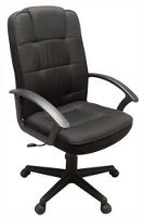
I think when i think of workplace -i think of the "office chair" -
enter image description here

It of course the most critical element for us to function in the office; but sometimes "Chair" is also extended with Connotations of "Position" in the hierarchy in the company. The bigger the chair you have - the more influential you are really! Sometimes the biggest guys are called "Chairman" or "Chairperson".

But yet, i am getting a bit clueless on how this can be translated as part of theme.

1

A new thought, why not have paper clips as the badge icons?

I can't think of any workplace representative icon better than a paper clip!

It's been part of the workplace for decades, first in physical form, then again as Clippy the paper clip in word.

0

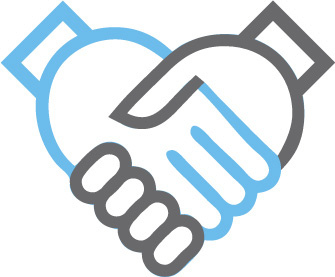
Handshake for a logo, like this:

http://vector-magz.com/wp-content/uploads/2013/11/handshake-icon2.jpg

Or water cooler, like this:

http://www.aperfectworld.org/clipart/office/water_cooler.gif

or like this:

http://chat.stackexchange.com/transcript/message/13353604#13353604

See also: Chatting various ideas of site logo at Water Cooler

You must log in to answer this question.

Not the answer you're looking for? Browse other questions tagged .